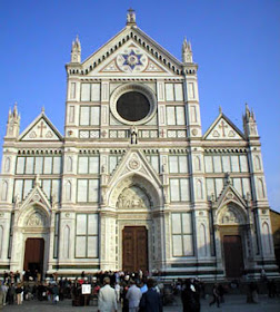
 Caio! Today (and tomorrow) we examine some of the beautiful sites of Italy. Much of the typical American styles for academic and government structures is heavily borrowed from Italian works (that which isn't borrowed from Greece, that is). It seems only right to give an homage to it. These photos were taken by my wife in 2003. Almost all of these photos may be clicked on to see a larger image.
My normally verbose commentary will be a lot more brief due to burning the ever-loving snot out of my hand last-night and temporarily losing the use of my index finger, so typing is a bit harder than photo editing at the moment. Between the toe on Saturday, and the hand on Wednesday, and bad news always coming in threes, I'm kind of dreading the fireworks this weekend.


 If I remember my architectural history correctly, this building was much more plain until the church added the additional decor. Romans were a pretty spartan lot (pun intended) and weren't given to excess ornamentation. Their work was mostly for pure function.


 I'm not really certain what the deal is with the rods positioned between the fan arches and the column. My guess is that they are there merely to provide a place to hang curtains for shows or exhibitions, but they might be there to lend extra structural support.
I included this photo because it's another great example of separation of space existing without walls, columns, or furniture. The mere presence of the statues along this bridge provides natural congregation points for people to meet and talk to one another privately, even while surrounded by people.

 This may get me flamed, but I feel it must be said. St. Peter's Basilica seems to be just too much. This is, perhaps, the consequence of having too many architects trying to pack too many styles into one building. Perfection is achieved not when there is nothing left to add, but when there is nothing left to take away.
 I hope you enjoyed this as much as I have. Tomorrow will be Italian Architecture (Part II)


